How to design for Dark Mode? 🖤

During my stay in Lofoten Islands in Norway I was able to experience the midnight sun — which is, to be honest, the complete opposite of dark mode.
It means that it is daylight around the clock. When the weather was good, I often stood on a peak at midnight and watched the passing sun on the horizon of the North Atlantic. If I got home sometime in the early morning hours, I wasn’t tired. My body didn’t understand that it was in the middle of the night because it was as bright as day outside.
Light has an enormous impact on our perception. But not only natural light and colors, but also that of our screens and the programs that flicker across them every day. You can already see where this is going today — it’s all about light, or just dark mode.
What is dark mode?
Dark mode is when the background and most elements of an app or website are dark and the font is in a very light shade. Dark mode has become more and more popular during the last years and many apps and websites offer their users the possibility to switch between dark and light mode.
Why to use dark mode?
Of course, dark mode is not just a fashion statement, and there are good reasons for it. Designing a digital product in dark mode requires a lot of effort. So what is the reason for making this investment in order to design a product in dark mode?
- When combined with the right colors, dark mode can look very modern and/or luxurious.
- For OLED displays, dark mode requires less energy and thus significantly extends the battery life
- Dark mode is a relief for the eyes in low ambient light conditions
- Dark mode increases accessibility for light sensitive users
- With a light-dark toggle you give your users the freedom to decide for themselves
Challenges of dark mode
If you want to design an additional dark mode for your app or website, you should consider the following challenges:
Checking for contrast — Make sure that the contrast between dark background and light text is high enough so that the text is easy to read and icons stand out well.
The color contrast is given as a ratio and the best way to measure this ratio is to use the Figma plugin Contrast.

How dark is dark — Pure white (#FFFFFF) on pure black (#000000) is not very user-friendly, because the contrast is too hard and this can lead to problems in visual perception.
Switch to a dark gray (e.g. #242424) for the background and a very light gray (e.g. #F7F7F7) for the font color. This will reduce the contrast and simplify the perception.
Elevation through contrast — In dark mode, you can’t use shadows to make elements stand out from each other. But there is another way to bring hierarchy into your design. That’s because in dark mode designs, you work with brightness. So an element that overlays another would have a lighter background than the one below it.
Fitting colors — The same colors often look different on light and dark backgrounds. Therefore, when you design a dark mode, you should not only change the layout, but also check the effect of the colors used and possibly create your own color palette for the dark mode design.
Dark mode best practices
Spotify is definitely a great source for design discussions and for dark mode. They explained quite well why they changed their green color for the play button and all the thoughts behind this decision.
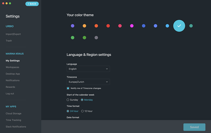
ClickUp offers its users the dark mode in addition to the light mode. In addition, users can also change the primary action color and thus customize quite a lot in the design to their own needs and preferences.

Need more inspiration? Then do a search on Dribbble for dark mode and click through the results.
While I’m not a fan of Dribbble as a source for the best user experience, when it comes to UI element design, there’s definitely a lot to discover here. And many of the dark mode designs are definitely worth a look.
Switching off the lights
As you can see, dark mode needs some practice and has some rules to follow. But I am sure that adding dark mode to an app or website makes the experience for the users more unique.
If you would like to support my work and with that help other people to find their way into UX/UI industry, you can support my mission by buying me a coffee here.
Need more insights? Follow me on Twitter or Instagram and sign up for my Grab a Coffee
newsletter if you would like to get news about UX and UI, breaking into tech and remote work directly to your inbox.
